In This Story
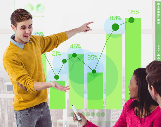
In e-commerce, time is literally money. Every delay, every unnecessary click, and each confusing label in your store will affect your bottom line. Research says that if your page is one second slow, conversions can tank by up to 7%. A confusing checkout? That's how you lose your most motivated customers.
The shoppers today don't just want speed, but effortless, enjoyable experiences. That's the promise of Frictionless UX: a shopping trip so smooth your users glide from browsing to buying without ever needing to think twice.
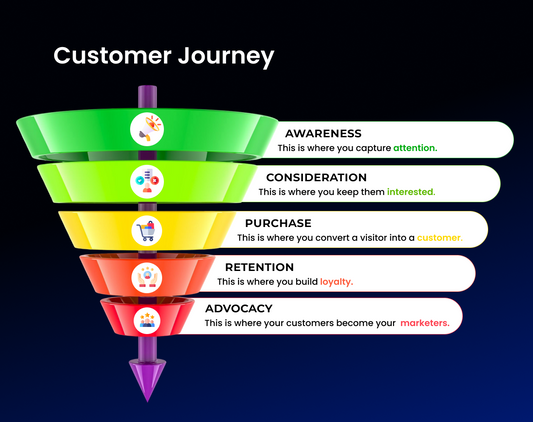
We’re going to break down the five essential areas for frictionless shopping: Speed, Simplification, Personalization, Transparency, and Experience Recovery, and show you how to turn hesitant browsers into confident buyers.
What Is Frictionless UX and Why Should You Care?
"Frictionless UX" means designing an online store with zero barriers, total clarity, and a seamless flow. Every page, button, and interaction should push users closer to hitting that "Buy" button, not slow them down or confuse them.It's the sweet spot where smart design meets human psychology. When customers feel in control, when navigating your site is second nature, and when checkout is nearly instant, trust goes up, frustration drops, and conversion rates soar.
The payoff for you?
- Lower bounce and cart abandonment rates
- Higher conversion and repeat purchase rates
- Stronger brand loyalty that brings customers back
Let’s see how to put this into practice.
1. Speed & Accessibility: Building Your Foundation

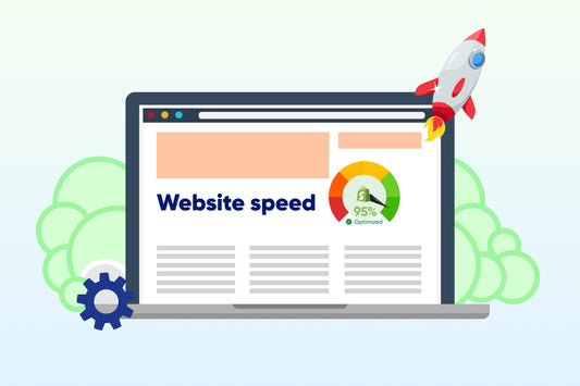
Make Your Load Times Lightning-Fast (Sub-2 Seconds)
Speed isn't a perk it's mandatory. Studies show over half (53%) of mobile users bolt from a site that takes more than 3 seconds to load. You're losing sales just waiting for your page to appear!
To keep users engaged and buying:
- Compress and lazy-load all images.
- Eliminate scripts that block the page from rendering.
- Use a global Content Delivery Network (CDN) for faster content delivery worldwide.
- Preload critical assets.
Think of every millisecond as cash—because it is.
The Mobile-First Rule: Design for High Conversions
Mobile isn't coming it's here. Since 70–80% of e-commerce traffic is on phones, your frictionless UX must start with a mobile-first design.
Prioritize these elements:
- Thumb-friendly navigation.
- Sticky "Call to Action" (CTA) buttons.
- Large, readable typography.
- A simplified mobile checkout flow.
- Minimal, non-intrusive pop-ups.
A basic responsive layout isn’t enough; you need to design specifically for touch behavior, not just screen size.
Use the Sticky ATC Button Strategy
A sticky "Add to Cart" (ATC) button is one of your simplest, most powerful conversion tools. When shoppers scroll through long product descriptions or reviews, keeping the ATC button visible ensures the option to buy is always there.
Quick tips:
- Use sharp color contrast and subtle animations so it stands out.
- Test its placement (bottom of the screen works great).
- Ensure it never covers important content like pricing.
That little persistent button can boost your conversions by as much as 8–10% in high-traffic product categories.
2. Checkout Simplification: Clear the Path to Purchase
![]()
Eliminate Friction: Implement Guest Checkout
What’s a major conversion killer? Forced account creation. Almost 28% of shoppers abandon their carts because you made them create an account first.
Guest checkout is Frictionless UX 101 it respects their intent to buy now. You can always offer to create an account after the purchase, maybe with an incentive like easier order tracking or faster reorders.
The Value of Convenience: Autofill Strategies
Autofill is simple digital magic. When users can auto-populate their addresses, cards, or email fields, it cuts form completion time by 30–40% and reduces the hassle of typing on a phone.
Integrate browser autofill or payment APIs (like Apple Pay or Google Pay). The less your customers have to type, the faster they will buy.
Optimize Payments: Offer Multiple Options
Payment flexibility builds trust. Some shoppers want security (PayPal), others need financial options (Buy Now Pay Later or BNPL), and some rely on accessibility (Cash on Delivery or COD, depending on your market).
Offering multiple payment modes ensures you don't leave any shopper behind and maximizes your completion rates at the final stage.
Boost Conversions with Express Checkout
This is where speed meets convenience. Express checkouts like Shop Pay, Apple Pay, and Google Pay reduce the click count from twelve down to two—a proven conversion catalyst.
These services store verified credentials and let users skip redundant form-filling, making mobile purchases virtually instantaneous.
Guide the Customer: Use a Checkout Progress Bar
A progress bar gives shoppers a sense of direction and completion. It removes the uncertainty and perceived effort—two top reasons for checkout drop-offs.
A simple "Step 2 of 3" indicator can psychologically reduce friction, letting users know the finish line is in sight.
3. Personalization & Continuity: Keep Shoppers Connected

Seamless Shopping: Utilize Saved Carts
Saved carts convert intent into action. When customers come back days later and find their items waiting, it signals convenience and care.
Pair this feature with gentle cart reminder emails or push notifications to quickly reclaim sales you might have lost.
Persistent Cart Across Devices is Key
Modern shoppers browse on their phone, compare on their laptop, and buy whatever's handy. A persistent cart makes sure that its selections follow them everywhere.
Use cloud-synced sessions to maintain continuity. It's the digital equivalent of holding their spot in line.
4. Transparency & Trust: Eliminate Doubt at Checkout
![]()
Transparency in Shipping: Display Clear, Upfront Costs
Nothing kills trust faster than surprise fees. Over half (55%) of users abandon carts because of unexpected shipping costs.
Fight this with total transparency:
- Display shipping fees early (even before the cart page).
- Offer clear "free shipping above $X" banners.
- Show delivery estimates clearly and upfront.
Trust grows when there are zero last-minute shocks.
Checkout Clarity: Ensure Zero Hidden Fees
From sales tax to handling fees, customers expect you to be honest. A clear, itemized breakdown of the total cost removes skepticism and makes users feel in control of their purchase.
Use plain, simple language no fine print, no asterisks.
Make Returns a Non-Issue
Shoppers buy more confidently when they know returns are easy. A highly visible "30-day no-questions-asked return" guarantee can increase conversions by 12–15%.
Clearly link your return policy near the "Place Order" button and reinforce the guarantee in your post-purchase emails.
5. Experience & Recovery: Enhancing Confidence and Saving Sales

Visual Merchandising: Leverage Zoom, 360°, and Video
High-quality visuals do more than just look pretty they reduce uncertainty. Shoppers need to see your products in a real-world context before committing.
Integrate these:
- 360° rotations for a full view.
- Zoomable high-resolution images.
- Product demo videos showing features in action.
Better visuals boost buyer confidence and keep them on the page longer—both strong trust signals.
Reduce Returns with Tech: Size Guides and AR Try-On
Returns usually happen because expectations don't match reality. Interactive tech like detailed size guides, virtual try-ons, or fit finders closes that gap.
This not only increases buying confidence but also cuts the operational costs tied to processing returns.
Optimizing Exit-Intent Popups: The Last-Chance Strategy
The best UX can't stop every exit—but it can save many. Exit-intent popups, triggered just as a user moves to leave the page, can recover 10–15% of abandoning users.
Follow these best practices:
- Offer a small, immediate incentive (like 5–10% off).
- Keep the design light and friendly.
- Include a softer option like "Remind Me Later."
This is your digital last handshake before they leave, so make it count!
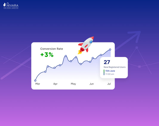
How Nivara Commerce Achieved High Conversion Rates: The Real-Life Strategy
Nivara Commerce's strategy for achieving high conversion rates, as shown by the Wetsu and Iwon Organics cases, worked on a direct, user-centric approach that tackled both performance and psychology.
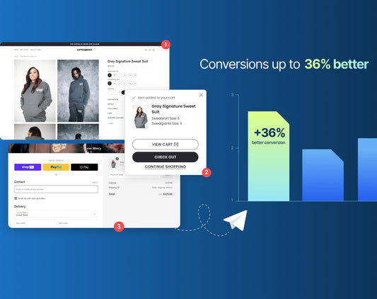
82% Increase in Conversion Rates for Wetsu
For Wetsu, the huge 82% increase in conversion rates is built on fixing foundational issues. We focused intensely on Speed and Accessibility. This resulted in a staggering 97% faster load time. This wasn't just a technical fix as it immediately reduced the psychological friction of waiting, cutting down the bounce rate and ensuring more users stayed on the page to shop.
We then focused on Simplification and Trust. Our team completely redesigned the cluttered site and poor navigation by introducing intuitive filters and a better layout. We made products effortlessly to find and reduce user frustration. We also integrated social proof (testimonials and videos). This built immediate trust and authority, converting hesitant browsers into confident buyers.
A 20% Increase in Conversion Rates for Iwon Organics
With Iwon Organics, the 20% conversion increase followed a similar formula but highlighted Personalization and Engagement. Nivara went beyond a clean look and created a custom shopping experience. We also added options like subscription options and dynamic product discovery tools. This strategy changed a generic browsing experience into a sticky, personalized one, encouraging immediate purchases and future retention.
In both these cases, Nivara's success wasn't about a single trick. It was a holistic, "frictionless" approach: make it fast, make it easy, and make it trustworthy. By focusing on speed and clarity while layering on elements of trust and customization, We very effectively streamlined the path from "browse" to "buy."
Key Takeaways
To build a truly frictionless e-commerce store:
- Speed and Accessibility are the essential foundation of trust.
- Simplified Checkout reduces abandonment and creates flow.
- Personalization & Continuity connect the shopping journey across all devices.
- Transparency & Trust reassure hesitant customers and build loyalty.
- Experience & Recovery closes the loop and brings lost sales back.
Frictionless design is about way more than just fewer clicks it’s about giving your shoppers more confidence, clarity, and control.
You’ve seen what we did for Wetsu and Iwon Organics—real results built on making the shopping experience effortless. If your site is slow, your checkout is confusing, or your conversion rate is flatlining, you're leaving serious money on the table.
Stop guessing and start gliding.
Let’s audit your site today. We’ll pinpoint exactly where your customers are hitting friction and map out the fastest path to a smoother, faster, and higher-converting store.
FAQs
1. What exactly is frictionless UX in e-commerce?
It's the practice of removing any obstacle that slows down or confuses the shopper—from slow load times to unclear buttons—to create a smooth, enjoyable buying journey.
2. What’s the fastest way to reduce checkout friction?
Enable guest checkout, use autofill features, integrate express payment options (like Shop Pay or Google Pay), and always show shipping and total costs upfront.
3. Why should I worry about page load speed?
Because it costs you sales! A mere 1-second delay can cut your conversions by up to 7%. Faster sites also keep users engaged and naturally improve your search engine ranking.